Johnian magazine issue 48, spring 2022
Free Places: A tale of two charts
As Associate Director of Development at St John’s, Rachel Powell is no stranger to the importance of tangible data. Here she considers the power of hard facts and the numbers behind the Dobson Free Places scheme.
When I joined St John’s in 2014, the College’s focus was shifting towards improving student support, and I was soon out drumming up Johnian backing for what would become the Studentships pilot scheme. Just a few conversations made it clear to me that merely repeating the received wisdom that ‘degrees are much more expensive nowadays’ and ‘the Ivy League offer far more generous bursaries than Cambridge’ wasn’t really going to cut the mustard in convincing such highly analytical minds to support College bursaries over a multitude of other worthy causes. I needed to ‘show’ rather than ‘say’. I needed charts. And for charts I needed data.
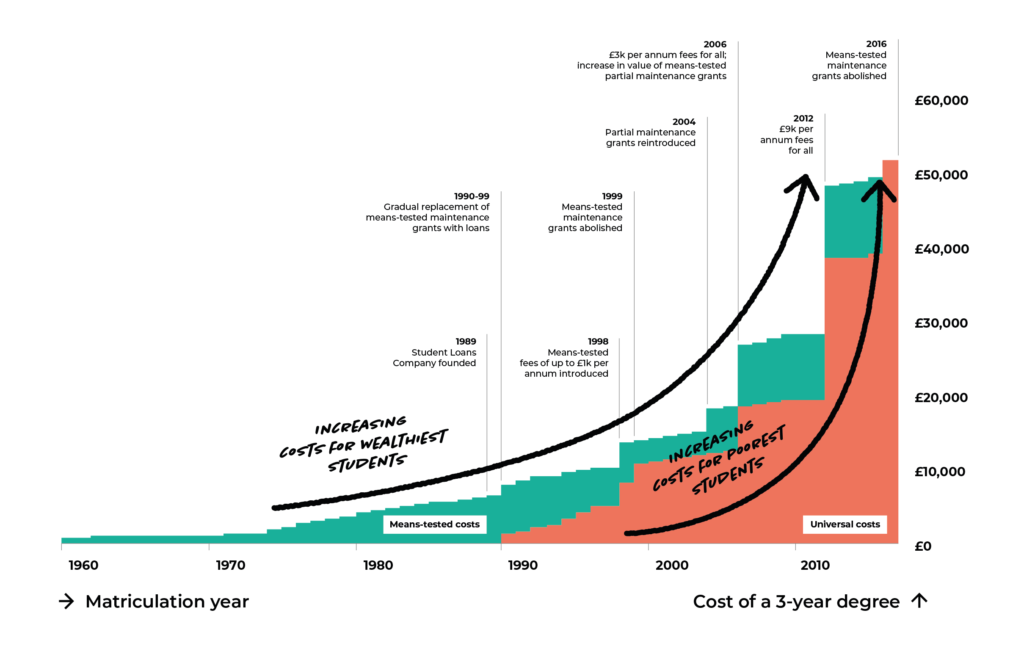
After many hours trawling through the Commons Library and the government research and statistics archive online, I was able to piece together the nominal value of tuition fees, maintenance grants and any associated student loans for every year from 1960. From these, an indicative ‘cost of degree’ could be calculated and broken down into means-tested versus universal costs. What was striking about the resulting timeline-chart was not the overall increase in the cost of a degree over the past few decades, although that increase was indeed marked, but the even more rapid stripping away of the means-tested element of those costs.
The data that would allow a comparison of the Harvard scholarship offering with the Cambridge Bursary scheme was easier to find, but far more laborious to collect. Running 30 household incomes through Harvard’s online Scholarship calculator did not prove to be the most riveting of afternoons, but, when combined with the data for the Cambridge Bursary scheme, produced a striking chart where the disparity between the degree of means-testing was laid bare.
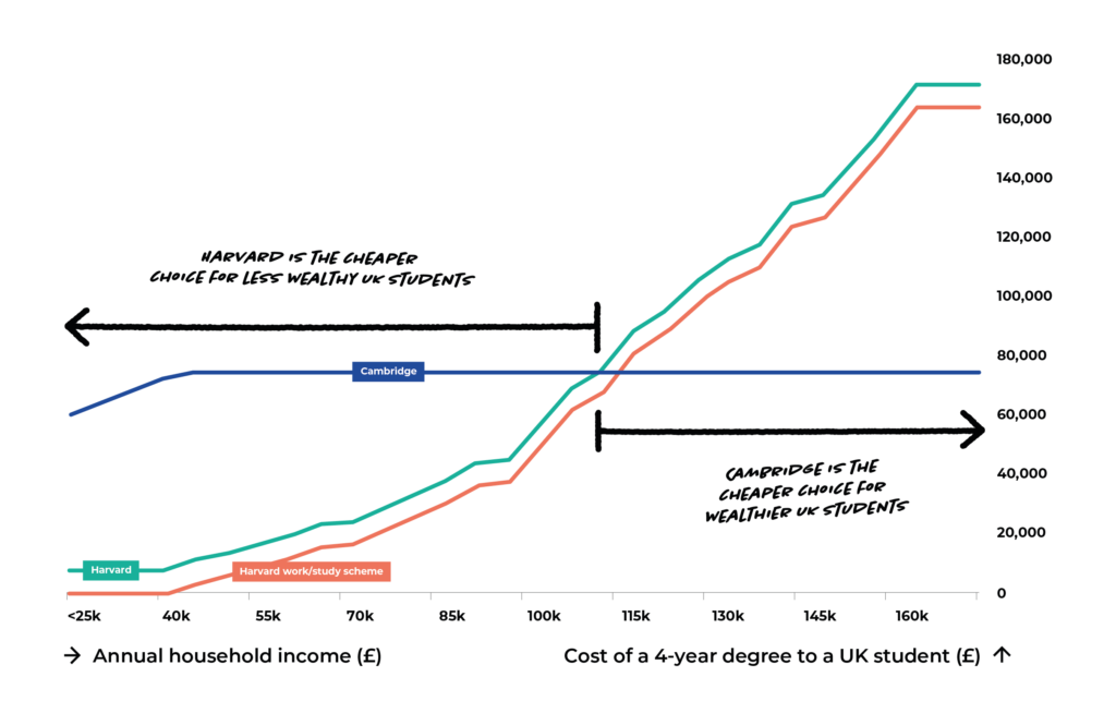
These two charts first featured in the fundraising literature for the Studentships pilot scheme in 2016 and remain an excellent visual representation of why we are so passionate about improving student support at St John’s. I come back to them often in my conversations with Johnians, and the Harvard comparison in particular lends itself very well to a quick sketch on the back of a napkin!
The launch of the Studentships scheme saw the special St John’s versions of these charts begin to diverge from the general trend. In 2023 the introduction of completely free places for students eligible for free school meals will see us become genuinely competitive with Harvard at the lowest household income levels. UK undergraduates with household incomes below 60% of the national median will be eligible for a free place at St John’s. These students will have both their maintenance and tuition fees covered by the College, allowing them to graduate completely debt-free. I greatly look forward to redrawing these charts as our plans for a world-class student support offering become a reality.
Visit our webpage for more information on the Dobson Free Places scheme and the matched giving challenge that will make it a reality.
If you would like to discuss this article please email r.powell@joh.cam.ac.uk
Written by
Rachel is Associate Development Director (Head of Major Gifts). She meets with Johnians to discuss the College’s current situation and priorities, and she explores ways that the Johnian community can work together to ensure that future scholars are able to enjoy the opportunities that St John’s has offered for generations.